In my previous post, I took a look at document-pivot methods in Topic Detection and Tracking. Document-pivot approaches use clustering to find out what people are talking about, but that’s not the only solution. In this post, I take a look at feature-pivot methods, the second type of Topic Detection and Tracking methods. Instead of looking at what people are talking about, these approaches look at how people are talking to detect that something happened.
In my previous post, I talked about how there are various ways of categorizing Topic Detection and Tracking methods. Most relevant to this post are the two very common ways of solving the problem: document-pivot and feature-pivot methods.
Both document-pivot and feature-pivot approaches answer simple questions:
- Document-pivot: what are people talking about?
- Feature-pivot: how are people talking?
If you haven’t read the document-pivot article, it’s a good starting point for this one. In that article, I showed you how document-pivot methods use clustering to identify what people are talking about. However, they are quite naïve, and thus limited, which is why feature-pivot methods are more common.
The intuition behind feature-pivot approaches is very simple. If you are at a stadium and people suddenly start shouting, you immediately think that something must have happened. There really isn’t more to it than that in terms of motivation. Because the intuition is so broad, feature-pivot methods are generally more flexible than document-pivot ones, and also far more common.
What’s the feature in feature-pivot methods?
The name of document-pivot methods indicates what those approaches focus on very clearly—documents. On the other hand, a feature can be many things, can’t it? In fact, the first and most important decision you have to make in feature-pivot methods is what a feature means to you. Here are a few examples of what features can be:
- The number of tweets published per minute.
- The change in the number of tweets published since last minute.
- The number of times a word is mentioned per minute.
So, at the risk of oversimplifying, a feature is something that:
- You can measure, and
- Helps you understand how people are talking about the event.
There is no right or wrong answers here: you can come up with your own feature. The features I mentioned above just happen to be some of the simplest approaches in Topic Detection and Tracking systems. Be aware, however, that not all features will be equally-helpful, as we’ll see.
What tweeting volume tells us about events
The running example in this post is a football match between Southampton and Arsenal. I collected tweets for this match myself to use it as part of my research. Arsenal won 2-0, and Southampton’s Jack Stephens received a red card towards the end of the match.
The first visualization below shows why feature-pivot approaches make so much sense. The time series shows the number of tweets about the match at each minute. Just by looking at how much people were talking, you can already figure out when the important things happened.
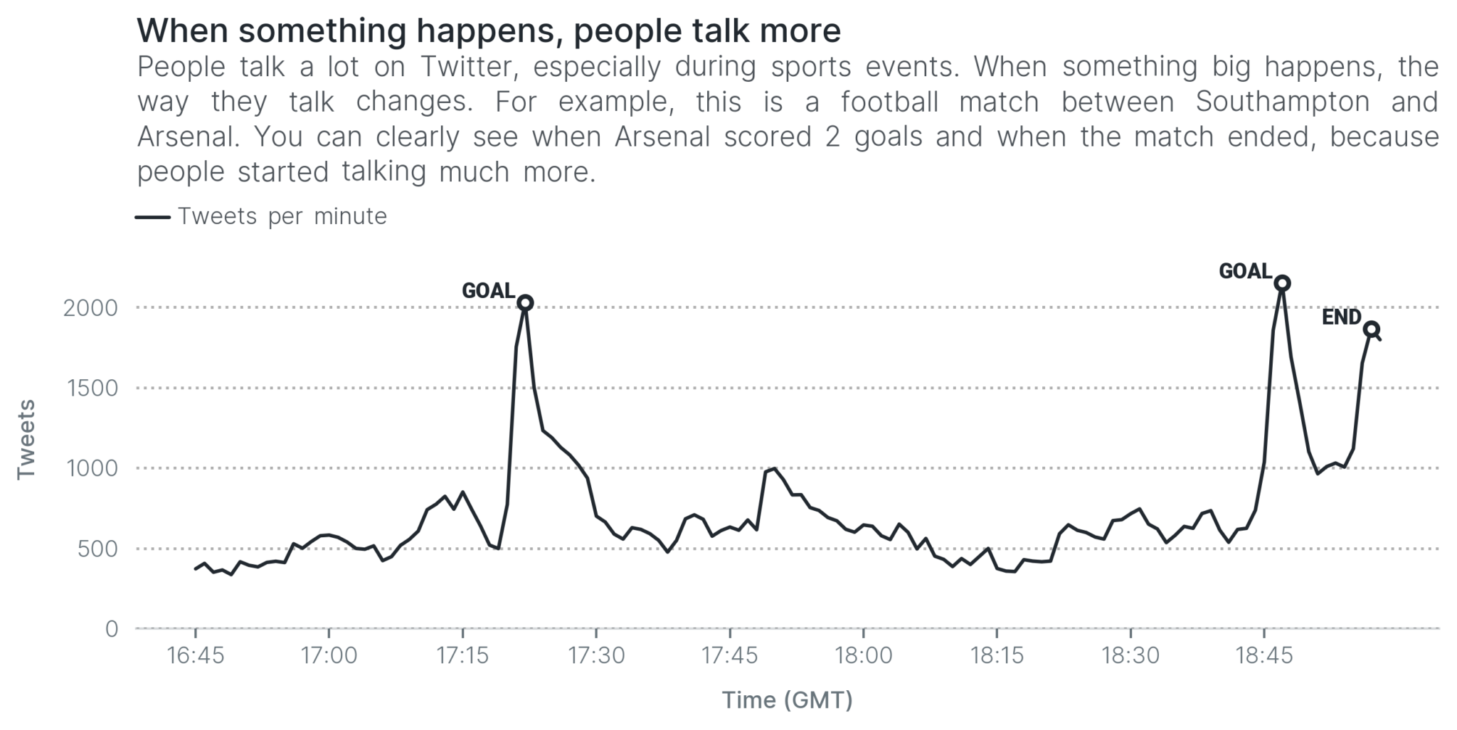
You cannot tell what happened exactly had the visualization not been annotated, but it is clear that some things did happen. How did you figure that out? Because Twitter users were talking a lot during those moments.
That’s a lot of tweets!
The simplest reasoning we can employ when detecting topics during an event is that when many people are talking, then something must have happened. In the next visualization, we decide that something happened whenever we receive more than 1,000 tweets in a minute. With this very simple reasoning, we are able to detect the two goals and the end of the match.
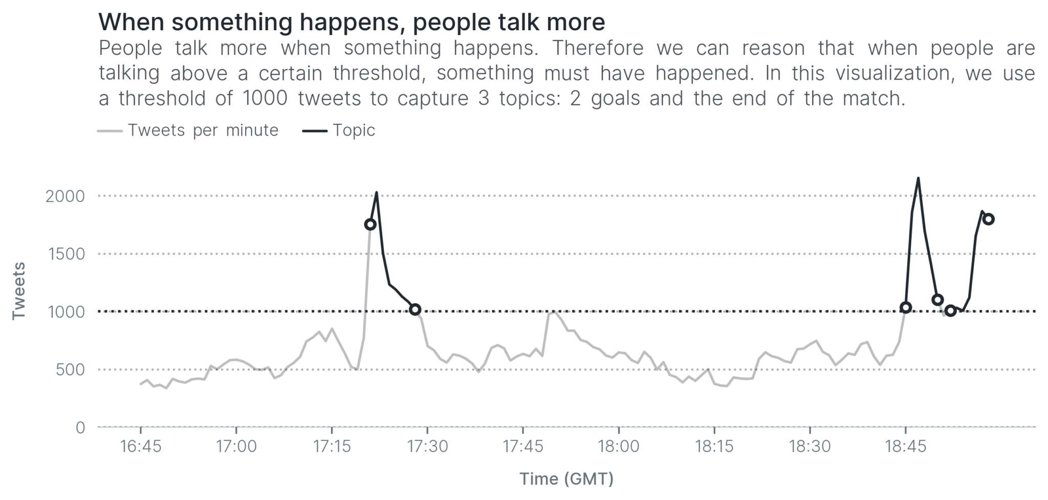
This reasoning is very simple and as you can see, it yields some results that make sense. However, it isn’t a very smart system, is it? Why did we set the threshold at 1,000 tweets per minute? No reason in particular, except for our observation. In another event, 1,000 tweets may be too low, or too high, so we’d have to adapt it depending on the data at hand.
Apart from that, we missed many topics even in this match: the start of the match, half-time and others. We could lower the threshold to 500 tweets per minute. However, the lower we set the bar, the more likely it becomes that we capture noise (something that isn’t a topic).
In other words, the system is a bit limited: it is quite dumb and it’s difficult to decide where to set the threshold. In fact, I cannot recall reading any papers that use this simple approach. So, on we go to the next approach: spikes.
Is that a spike? Detecting bursts in volume
Looking back at the tweet volume above, there’s something else that tells you that something happened. It’s not just that Twitter users talk a lot when something happens, but they do so at the same time. As a result, they produce a spike or, in Topic Detection and Tracking lingo, a burst.
The concept of bursts originated from Jon Kleinberg in this important paper. In that paper, Kleinberg tries to make sense of his cluttered email inbox by identifying periods of time when he started receiving more emails than usual.
We can apply the same reasoning for Twitter to identify spikes. For example, in the next visualization, we say there’s a burst if there is an increase of 25% in tweets from one minute to the next. When there’s a burst, we accept that as a topic—something happened.
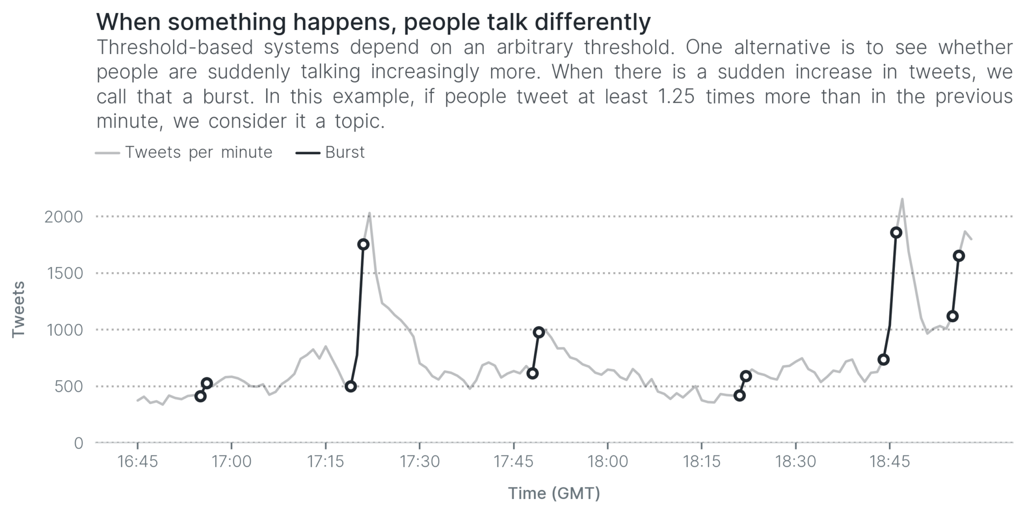
The reasoning we used here is very simple, but it works pretty to a certain extent. We captured both goals and the end of the match, as well as some other developments during the football match, like half-time.
Quick tip: the difference between volume and spikes is like the difference between a car’s speed and its acceleration. We’re not looking at how much people are talking at a particular minute, but whether they’re talking more than before.
This approach is simple, but it is the basis for this paper. (That’s a special paper for another reason: it’s the first one to use Twitter to build a timeline from a sports event.) In fact, using bursts generally works pretty well. It has been used in a lot of research, and it doesn’t have to be as simple as the way we used it here.
The problem with volume in feature-pivot methods
So far, we have used only the number of tweets (also known as the volume): we either set a threshold, or we examine how it’s changing. This Topic Detection and Tracking paper measures bursts in the volume, similarly to above, but it struggles with one particular problem. It can capture the goals in a football match quite reliably, but not yellow cards. Why is that?
Let’s go back to the intuition. When someone scores a goal, a stadium goes wild! In contrast, when someone receives a yellow card, there are generally only murmurs. The same thing happens on Twitter; people talk a lot more about goals (or important topics) than they do about yellow cards (or less important topics). As a result, less important topics do not create a spike, which makes it difficult to detect that they happened.
Are yellow cards absolutely essential? They’re not quite as important as goals, but ideally we are able to detect them so that the timeline is comprehensive. To detect topics that do not generate a spike, we need to work smarter with our data. The next feature-pivot method we consider goes a bit deeper to overcome this hurdle.
Going deeper: using term volume instead of volume
The reason why we see a spike in the volume is that something happened, and Twitter users talked about it. In fact, when talking about the thing that happened, Twitter users aren’t talking about random topics, but they are generally discussing the same thing and using similar words.
For example, when Eddie Nketiah scores for Arsenal, we expect Twitter users to mention the word goal and the player’s name, Nketiah. In fact, if you look at the next visualization, you can clearly see a spike in the number of words that mention the word Nketiah right around the same time as when he scored.
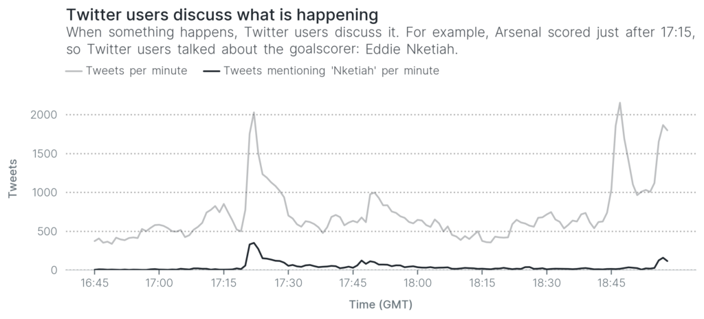
That spike just after 17:15 isn’t very different from the spikes we saw earlier. The only difference is that it peaks at about 400 tweets per minute, instead of 2,000 tweets per minute. Therefore we can use the same reasoning that we used earlier, but instead of considering all tweets, we focus on how words are being used.
Improving the granularity of feature-pivot methods
Southampton’s Jack Stephens received a red card against Arsenal. You can’t see it in the above visualizations as it happened very close to an Arsenal goal. With the same reasoning as before, if we focus only on tweets that include the word red, it becomes much clearer when Jack Stephens was sent off.
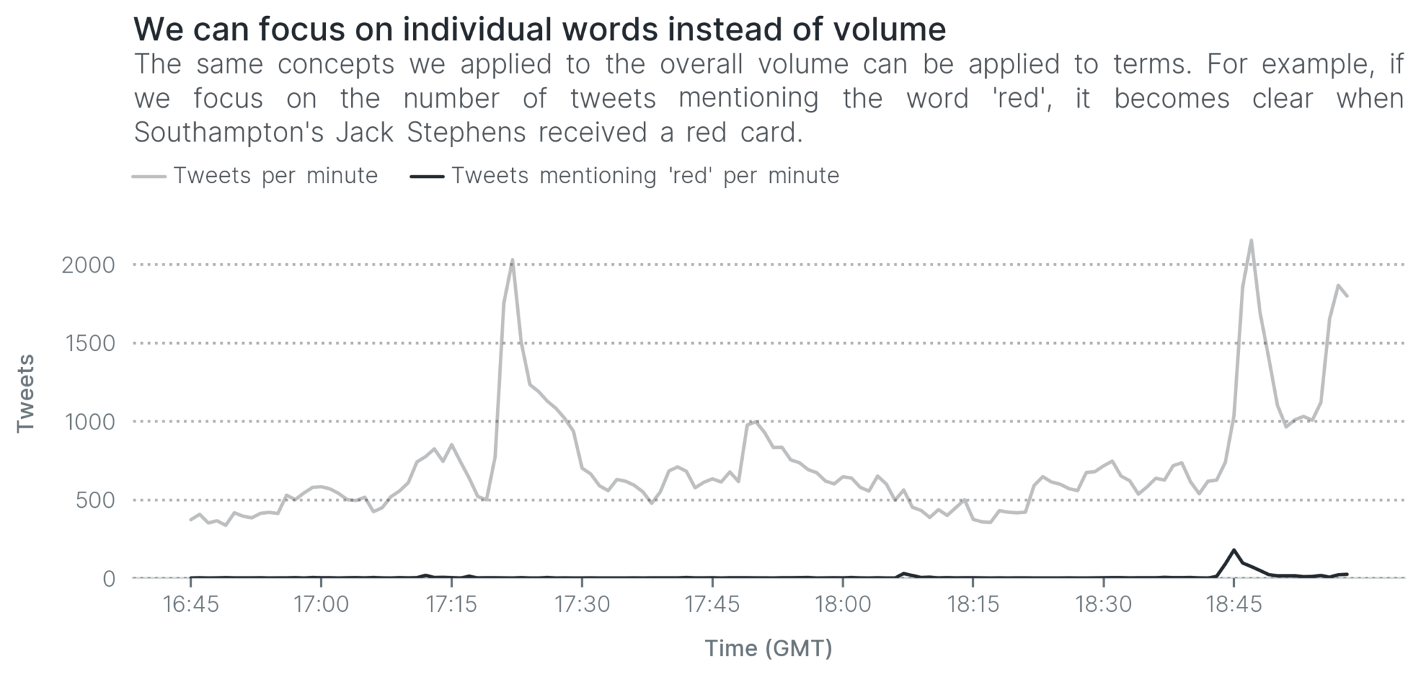
Can you see the increase in tweets mentioning the word red at 18:45? That’s when Jack Stephens received a red card, and people started talking about it, creating a small spike. Just like that, it becomes far easier to detect the red card.
This technique is quite common in Topic Detection and Tracking. We can focus on individual words to detect smaller topics from from any event. In fact, this alternative is more common than using the entire volume for this reason. It hasn’t only been used in sports events, but also to detect breaking news all around the world. For example, this paper calculates burst for every single word.
What if people aren’t talking?
Is detecting topics for each individual word, as we saw above, the final solution? Absolutely not. Like document-pivot approaches, feature-pivot methods also rely on a lot of users discussing the same topic. If they aren’t talking, then there’s not much we can do.
For example, in this running example, there were two yellow cards. The next visualization shows how many Twitter users mentioned the word yellow throughout the match. Can you detect when the two players received yellow cards?
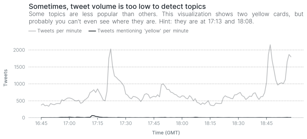
The first yellow card is barely visible (just before 17:15). As for the second yellow card, you’d have to squint really hard to see it: it’s at around 18:08 and it barely creates a bump. How do we detect those two yellow cards? With great difficulty, if we even detect them.
Apart from that, feature-pivot methods also struggle with some of the same issues as document-pivot approaches. The incident of Townsend knocking over a photographer is again relevant. Twitter users would suddenly talk more about the word photographer, creating a spike, but should it go into the timeline? Popularity does not always equate to newsworthy!
Back at Selhurst Park against Chelsea, Townsend ran into a photographer knocking her over, before checking she is OK and then chasing after the ball. Not something you see everyday.
— @bestgug
Feature-pivot or document-pivot?
As we saw in this post and the previous one, both document-pivot and feature-pivot approaches have their own disadvantages and advantages. The former is simple, but the latter is far more flexible.
That flexibility made feature-pivot approaches a very popular choice. The approaches in this post are just a small taste of the wide variation in feature-pivot methods. Other types of approaches include probability and others.
More importantly, both require a large dataset to build timelines that make sense. This is the biggest bottleneck when it comes to detecting topics from Twitter. Most events do not generate enough tweets to build comprehensive timelines. That does not mean we’ve lost the Topic Detection and Tracking battle, but only that we need to work smarter.
Reading
- Bursty and Hierarchical Structure in Streams. The first paper to talk about bursts in Topic Detection and Tracking.
- Human as Real-Time Sensors of Social and Physical Events: A Case Study of Twitter and Sports Games. The first paper that used Twitter to build timelines for sports events—American football matches. It uses bursts to detect when something happens.
- Summarizing Sporting Events Using Twitter. A feature-pivot method that uses burst to detect when something happens.
- Personalized Emerging Topic Detection Based on a Term Aging Model. A feature-pivot method that calculates burst for individual words.
- Earthquake Shakes Twitter Users: Real-time Event Detection by Social Sensors. A feature-pivut approach that uses probability to detect earthquakes from Twitter.