3. Time Series
Time series are among the most common types of visualizations, and with good reason. They are easy to create because they are simple, which means that they are also intuitive. All too often, we rely on that simplicity to tell a story well. Multiplex’s time series makes it easier for data to tell a story clearly.
Note
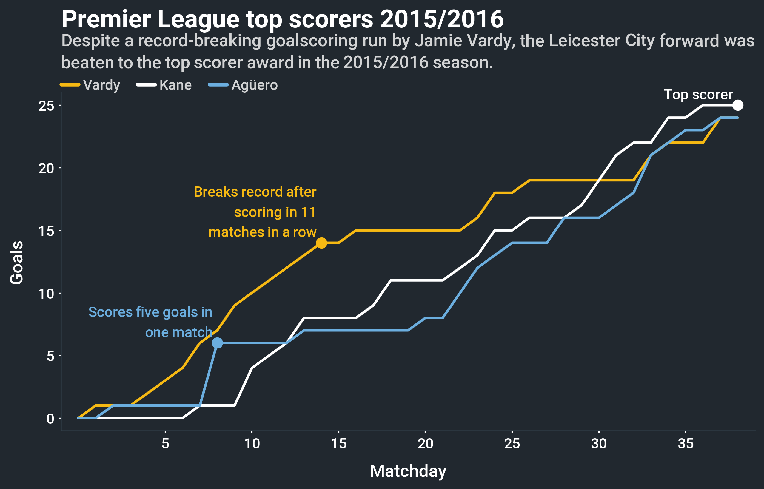
Can’t wait to start creating time series visualizations? Multiplex’s Jupyter Notebook examples are a quick guide to get you up and running. Check out the time series Jupyter Notebook tutorial to learn how to create the time series shown above, or to start creating your own time series visualizations.
The basic TimeSeries class borrows heavily from matplotlib’s plot function.
The only thing that it modifies is the way in which time series plots are labelled.
For example, Multiplex’s TimeSeries visualizations do not have a legend by default.
Instead, to aid readability, the label is added to the end of the time series.
If you prefer the more traditional way, you can also create a normal legend.
Creating a time series is very easy.
All you have to do is create a Drawable class and call the draw_time_series() function.
You can keep calling the draw_time_series() function on the same Drawable instance to draw more time series.
Like matplotlib’s plot function, it expects the x and y-coordinates of the time series: However, you can also add your own styling:
import matplotlib.pyplot as plt
from multiplex import drawable
viz = drawable.Drawable(plt.figure(figsize=(10, 10)))
viz.draw_time_series(range(0, 10), range(0, 10),
                     color='#F6B913', linewidth=2,
                     label='A', label_style={ 'fontweight': '500' })
viz.show()
Use the label keyword argument—and the related label_style—to annotate the time series.
By default, the label goes at the end of a time series, but you can set with_legend=True to draw a Legend.
-
class
timeseries.timeseries.TimeSeries(*args, **kwargs)¶ The
TimeSeriesclass builds on theLabelledVisualization. The reason why theTimeSeriesbuilds on that, and not the simplerVisualization, is that it supports drawing time series names at the end of the line. In these cases, theLabelledVisualizationautomatically ensures that the labels do not overlap. Like all visualizations, it revolves around thedraw()function.Aside from that, the
TimeSeriesclass borrows heavily from matplotlib’s plot function. The new functionality is the ability to add labels at the end of the lines. Instead of labels, you can also label time series in theLegend.-
__init__(*args, **kwargs)¶ Initialize the time series.
-
draw(x, y, label=None, label_style=None, with_legend=False, *args, **kwargs)¶ Draw a time series on the
Drawable. The function expects, at the very least, the points on the time series: a list of x-coordinates and their corresponding y-coordinates.If a
labelis given, it is drawn at the end of the time series. You can use thelabel_styleto style the label. If you prefer to add the label to theLegend, setwith_legend=True.Any additional arguments and keyword arguments are used to style the line. The function accepts any arguments and keyword arguments accepted by the matplotlib.pyplot.plot function.
Parameters: - x (list of float or
pandas.core.series.Series) – The list of x-coordinates to plot. The x-coordinates must have the same number of points as the y-coordinates. - y (list of float or
pandas.core.series.Series) – The list of corresponding y-coordinates to plot. The y-coordinates must have the same number of points as the x-coordinates. - label (str or None) – The plot’s label.
If given, the label is drawn at the end of the line or in the legend, depending on the value of the
with_legendparameter. - label_style (dict or None) – The style of the label.
By default, the time series’
coloris used for the label’s color, even if thecoloris not set in thekwargs. Thelabel_styleaccepts any styling option supported by theAnnotation’sdraw()function. - with_legend (bool) – A boolean indicating whether the labels should be drawn as a legend.
If it is set to
False, the labels are drawn at the end of the line. Otherwise, the label is added to theLegend.
Returns: A tuple made up of the drawn plot and label. If the legend label is drawn, only a string is returned.
Return type: tuple
Raises: - ValueError – When the number of x-coordinates and y-coordinates are not equal.
- ValueError – When no x-coordinates or no y-coordinates are given.
- x (list of float or
-