Multiplex
Visualizations should tell a story, and tell it in a beautiful way. Multiplex is a visualization library for Python built on these principles using matplotlib. This library aims to make it as easy as possible for you to transform data into beautiful visualizations that tell a story.
Note
This website describes all of Multiplex’s functionality and is only meant to be used as reference. You can browse this website when you need to know what arguments are supported by the visualizations.
If you are a new Multiplex user, a better starting point is the example notebooks.
Who is Multiplex for?
Multiplex is aimed at data scientists, researchers, students and all those who work with data and are familiar with Python.
Why should I use Multiplex?
Note
If Multiplex is based on matplotlib, why not use matplotlib directly?
Multiplex does not replace matplotlib. Anything that you can do with Multiplex, you can also do with matplotlib.
Multiplex makes it easier to create beautiful visualizations. This is achieved by providing:
- 4 custom matplotlib styles;
- Functionality to caption visualizations;
- Functionality to annotate any visualization with text; and
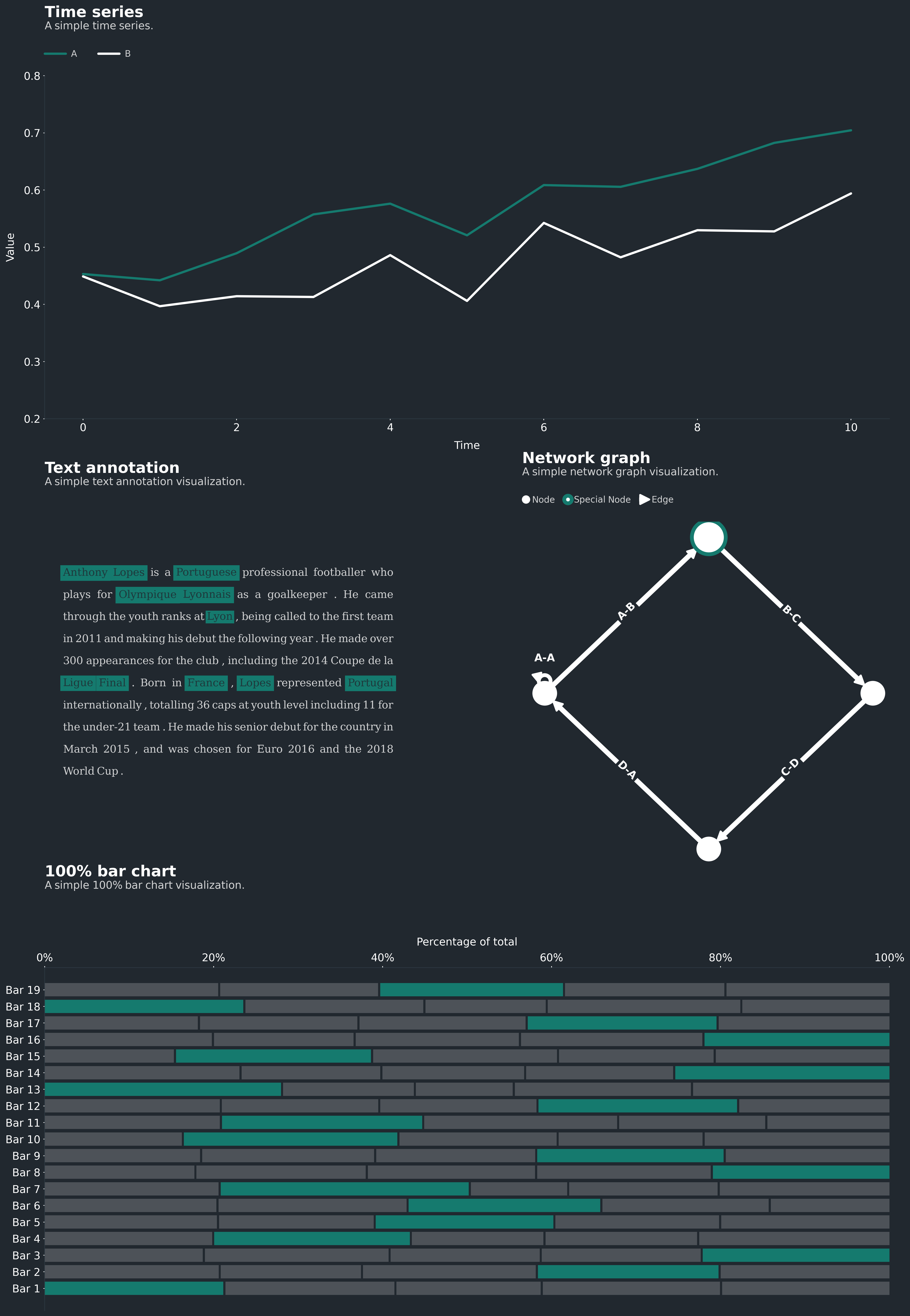
- New types of visualizations not available in matplotlib:
- 100% bar chart,
- Network graph,
- Slope graph,
- Population chart, and
- Text-only visualizations.
Multiplex automatically lays out your data so that you can focus on telling your story.
How do I use Multiplex?
To start using Multiplex, you can clone it using pip:
python -m pip install -U multiplex-plot
Prerequisites
Multiplex is based on matplotlib. You can install matplotlib using pip:
python -m pip install -U matplotlib
More details about it are available in matplotlib’s repository.
Multiplex also uses the following libraries in certain visualizations:
Quickstart
Creating visualizations with Multiplex is very easy. For example, you can create a text-only visualization in just 10 lines of code, including all styling options:
1 2 3 4 5 6 7 8 9 10 | import matplotlib.pyplot as plt
from multiplex import drawable
plt.style.use('styles/multiplex.style')
viz = drawable.Drawable(plt.figure(figsize=(10, 2)))
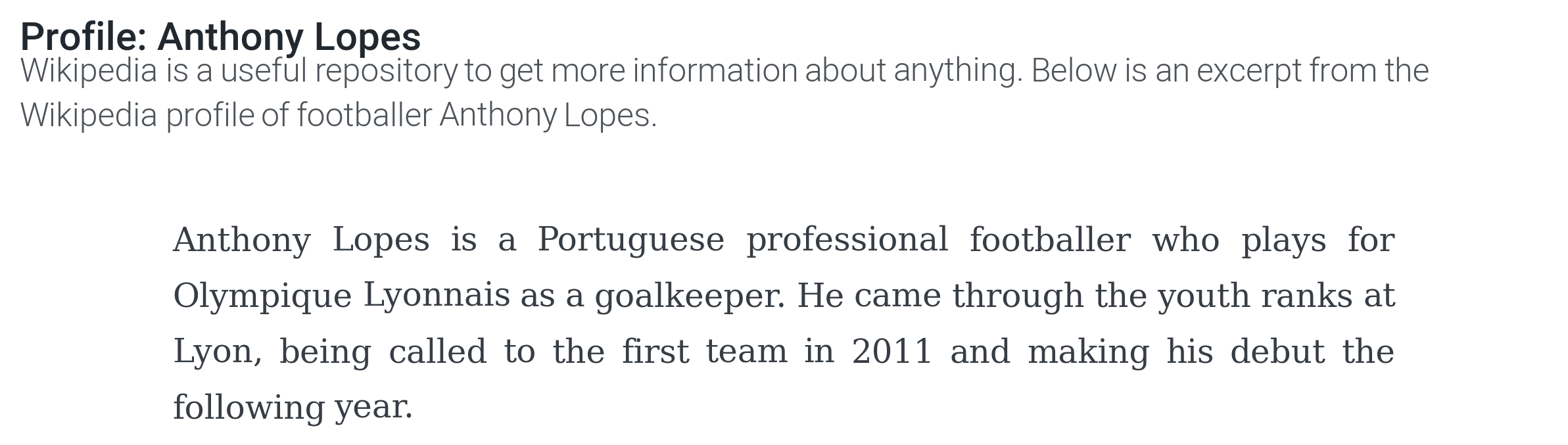
paragraph = """Anthony Lopes is a Portuguese professional footballer who plays for Olympique Lyonnais as a goalkeeper. He came through the youth ranks at Lyon, being called to the first team in 2011 and making his debut the following year."""
style = { 'align': 'justify', 'fontfamily': 'serif', 'alpha': 0.9, 'lineheight': 1.25, 'lpad': 0.1, 'rpad': 0.1 }
viz.draw_text_annotation(paragraph, **style)
viz.set_title('Profile: Anthony Lopes', loc='left')
viz.set_caption("""Wikipedia is a useful repository to get more information about anything. Below is an excerpt from the Wikipedia profile of footballer Anthony Lopes.""")
viz.show()
|
All it takes to draw a simple text visualization is 10 lines of code:
- 3 lines to import matplotlib, Multiplex and the visualization style;
- 3 lines to set up the visualization object, load the data and set the style;
- 4 lines to draw and show the visualization, including a title and caption.
Multiplex does all the tedious work for you: the layout, alignment and more. At the same time, you can take as much control as you want.